


About this listing
Material Design Components is listed with version, update, developer, screenshots, permissions, source, and compatibility details from the available app metadata.
APK and source facts
Before you install
- Android requirement is not listed in the current data.
- Package size is not listed in the current data.
- The source link points to a Google Play listing.
Listing evidence
Material Design Components includes version 1.2025.5, last update Oct 30, 2025, 15 screenshots, privacy policy link in the current metadata.
The current metadata notes that permission list is not available.
FungoApp review for Material Design Components
Material Design Components by BOLT UIX is listed in Libraries & Demo. This page organizes the available metadata into a practical review format, including version 1.2025.5, Android requirement not listed, update date Oct 30, 2025, rating 4.5 out of 5, and install signal 10,000+.
Browse Android app listings with metadata, source links, version details, compatibility notes, screenshots, and permission signals that help you compare apps before installing. For Material Design Components, use the details below as a checklist before you decide whether the app fits your device, privacy expectations, and use case.
Install decision context for Material Design Components
Material Design Components is best reviewed as a Libraries & Demo listing from BOLT UIX, not as a direct APK file from FungoApp. The current signals show version 1.2025.5, Android requirement not listed, last update Oct 30, 2025, rating 4.5 out of 5, install signal 10,000+, and monetization that does not list ads in the current data and does not list in-app purchases in the current data. Use those signals together: a popular listing can still be a poor fit if the permissions, update age, or account requirements do not match your intended use.
Use-case fit analysis
Material Design Components is presented around this purpose: "This Components are interactive building blocks for creating a user interface." A good fit is more likely when that purpose matches the category, screenshots, version history, and the kind of access the app requests. If you only need a narrow task, compare this listing with simpler alternatives before leaving FungoApp for the external source.
Permissions and privacy interpretation
Material Design Components does not include a permission list in the current FungoApp data. That missing field reduces review confidence, so readers should check the Android install prompt and source listing before using personal data or granting sensitive access.
Version and update interpretation
The listing shows version 1.2025.5, updated Oct 30, 2025, package size not listed, and Android requirement not listed. Newer updates can indicate maintenance, but the practical question is whether the listed Android requirement fits your device and whether recent changes explain why the app needs its current permissions and storage footprint.
Screenshot review prompts
Material Design Components includes 15 screenshots in the current listing data. Use them to confirm the interface, account prompts, ads, paywalls, editing tools, game style, or workflow before you open the source page. Screenshots are evidence of presentation, not independent proof of package behavior.
Use case fit
Material Design Components is summarized as: "This Components are interactive building blocks for creating a user interface." Compare that promise with the screenshots, category, update notes, and related apps before installing.
Version and compatibility
The listing shows version 1.2025.5, Android requirement not listed, package size not listed, and last update Oct 30, 2025. These details matter because older devices, large packages, and stale updates can change the install experience.
Privacy and permissions
Material Design Components does not include a permission list in the current metadata, so review the source listing and Android install prompt carefully.
Review checklist
- Confirm the developer name and source listing before installing.
- Review version, Android requirement, package size, and update date.
- Compare requested permission access with the feature you actually need.
- Read recent change notes and ratings as signals, not as guarantees of safety.
Comparison prompts
- Compare Material Design Components's developer and source link with other Libraries & Demo options before installing.
- Check whether version 1.2025.5 and Android not listed match your device.
- Review the source listing carefully because FungoApp does not currently have a permission list for this app.
- Compare against related listings such as Quran Pro: Read the Holy Quran and Payment Module for feature scope and privacy tradeoffs.
Publisher notes
- FungoApp organizes public listing metadata into review notes and comparison checklists for Material Design Components.
- FungoApp does not host the APK file, modify the app package, or claim independent file verification from the current data.
- The 4.5 rating is positive, though rating volume and recent reviews should be checked on the source listing before treating it as a strong quality signal. 10,000+ installs provide a modest adoption signal; compare it with category fit and developer transparency.
Developer-provided description
This app is for developer demo purposes.
📚 Source Code: GitHub - Material Design Components
https://github.com/boltuix-store/Material-Design-Components
📖 Documentation: Material 3 Guidelines 2025
https://www.boltuix.com/2025/06/material-3-guidelines-2025.html
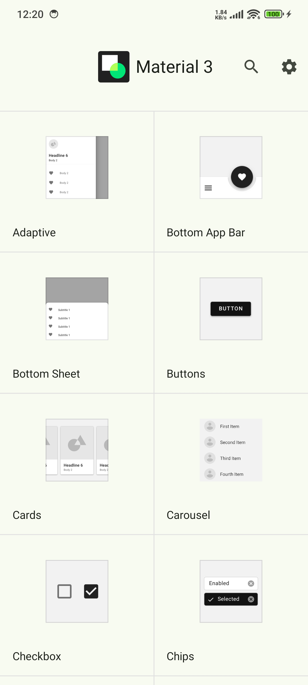
Material is an adaptable system of guidelines, components, and tools that support the best practices of user interface design. Backed by open-source code, Material streamlines collaboration between designers and developers, helping teams quickly build beautiful products. 🌟
Components 🛠️
Material Components are interactive building blocks for creating a user interface.
Here's the comprehensive list with added components:
* Adaptive 🖥️: Flexible layouts for various screen sizes
* App Bars: Bottom 📱: Navigation and action bars at the screen bottom
* App Bars: Top 📍: Navigation bars at the top of the screen
* Backdrop 🎨: Layered content with a front and back view
* Badges 🔔: Badges for notifications or status on UI elements (BadgeDrawable)
* Banners 📢: Temporary messages for user attention
* Bottom Navigation 🧭: Switch between UI views at the bottom
* Bottom Sheets ⬇️: Secondary content anchored to the bottom of the screen
* Buttons 👆: Core components for triggering actions in a UI
* Buttons: Floating Action Button (FAB) ➕: Floating action buttons for primary actions
* FAB Menus 🔄: Menus expanding from FABs for related actions
* Cards 🗂️: Display content and actions for a single subject
* Carousel 🎠: Scrollable collection of items on and off screen
* Checkboxes ✅: Select one or more items or toggle on/off
* Chips 🏷️: Enter info, make selections, filter, or trigger actions
* Data Tables 📊: Organize and display structured data
* Date Pickers 📅: Select a date or range of dates
* Dialogs ❗: Important prompts in a user flow
* Dividers ➖: Thin lines to group content in containers
* Docked Toolbar ⚓: Fixed toolbars for frequent actions
* Floating Toolbar 🛠️: Dynamic toolbars for contextual actions
* Icon and Segmented Buttons 🖼️: Buttons with icons or segmented options for interaction
* Image Lists 🖼️: Grid or list of images
* Lists 📋: Vertical lists for content display
* Loading Indicators 🔄: Visual cues for short loading processes
* MaterialTextView ✍️: Enhanced text display component for Material 3
* Menus 📜: Display a list of choices on a temporary surface
* Navigation Drawer 📂: Switch between UI views on larger devices
* Navigation Rail 🚆: Switch between UI views on mid-sized devices
* Progress Indicators ⏳: Show unspecified wait times or process duration
* Radio Buttons 🔘: Select one option from a set
* Search Bar 🔍: Enter keywords or phrases for relevant information
* Selection Controls 🎚️: Manage user selections (checkboxes, radio buttons, switches)
* Sheets: Bottom 📄: Secondary content at the screen bottom
* Sheets: Side 📑: Secondary content anchored to the side of the screen
* Side Sheets 📘: Secondary content anchored to the side
* Sliders 🎚️: Make selections from a range of values
* Snackbars 🔔: Brief updates about app processes at screen bottom
* Switches 🔄: Toggle the selection of an item on or off
* Tabs 📑: Organize content across different screens and views
* Text Fields ✍️: Allow users to enter and edit text in a UI
* Time Pickers ⏰: Help users select and set a specific time
* Tooltips 💡: Brief descriptions for UI elements
🚀 Now Available on CodeCanyon
Purchase the Kotlin version of Material UIX - your ultimate toolkit for crafting sleek, modern, and responsive user interfaces.
Modern App Template – A Responsive and Customizable UI Kit for:
* Jetpack Compose
* Android Kotlin
* Flutter
👉 Get it on CodeCanyon
https://codecanyon.net/user/boltuix
Requirements (Latest version)
Android requirement is not listed in the current metadata.


